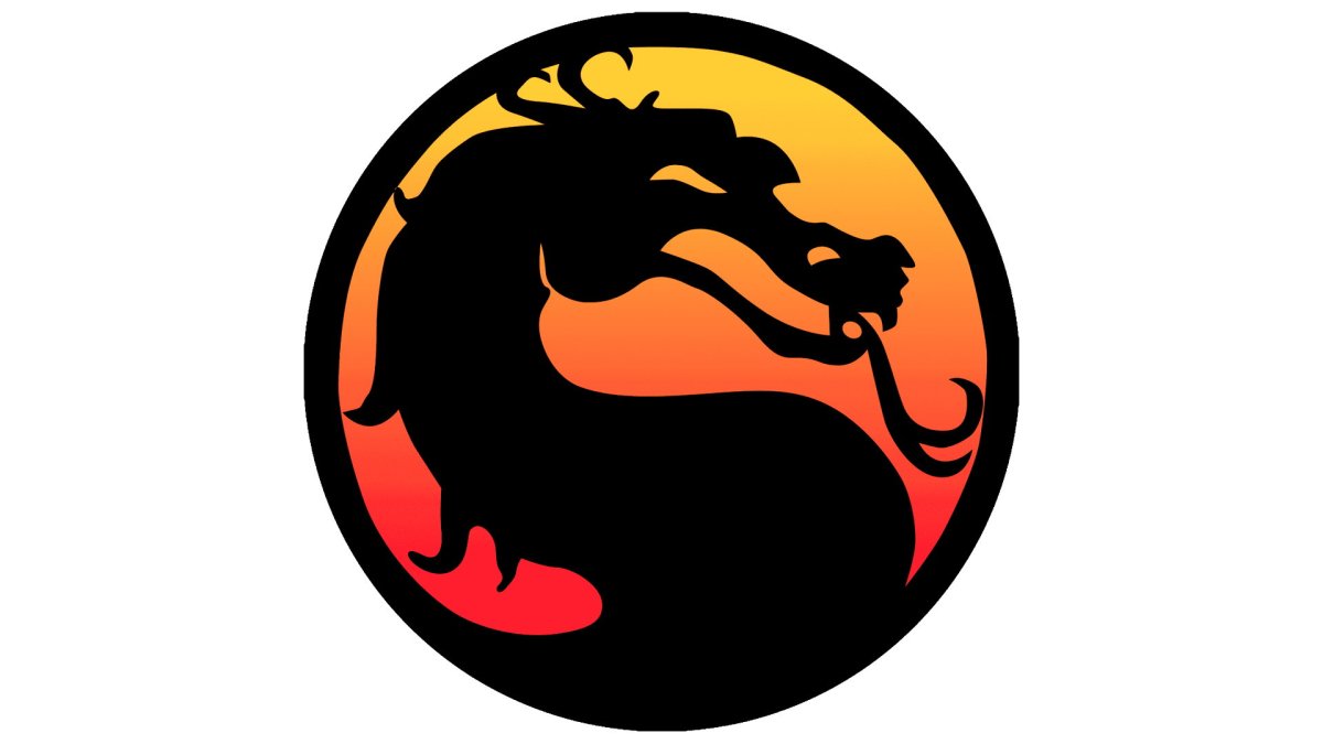
I grew up in the ’90s when games like Mortal Kombat started becoming popular. I recall playing the original Mortal Kombat for the first time on my Sega Genesis. It was pretty much love at first uppercut. From then on, whenever I saw that dragon logo I felt the warmth of its familiarity and the anticipation that someone was probably going to soon get cut in half. It was usually me. But where did that design come from? Mortal Kombat co-creator John Tobias recently took a trip down memory lane to talk about the creation of the dragon logo, and how it counts its inspirations among Queen.
Tobias not only provided a lengthy tale on its creation on Twitter, but he came prepped with the receipts. His Twitter thread is chock full of original design sketches of the dragon, as well as the prototype name and logo for Mortal Kombat. He shared early sketches of the game’s arcade cabinet, and more. Tobias also mentioned that the logo was nearly scrapped after his sister thought it looked like a seahorse.
And now that you mention it, it kind of does.
Side Note: I almost tossed the dragon icon sketch aside when I was at home working on it at my drafting table and my sister mistook the dragon for a seahorse ¯_(ツ)_/¯ pic.twitter.com/d1omW1as1A
— John Tobias (@therealsaibot) September 22, 2022
Rock the dragon
But to circle back to the question: from where did the logo originate? In its early stages, Mortal Kombat was called ‘Dragon Attack,’ named after a 1980 song by the rock group Queen. It was changed later to Mortal Kombat by Tobias and the game’s other co-creator, Ed Boon. However, the duo needed a recognizable logo for their blossoming fighter franchise, something “like Superman’s ‘S’ or Batman’s bat symbol,” Tobias wrote.
The dragon’s design originates from a golden dragon statue that sat on the desk of then-Midway general manager, Ken Fedesna. That same dragon ended up scanned and included in the game, and you can see two copies of it standing in the center of the Shang Tsung’s Throne Room arena.
Tobias used that dragon to adorn the arcade cabinet design, and then turned that dragon’s head into the logo we see today. As for whether the dragon should look left or right, before Mortal Kombat II hit consoles Acclaim asked for “one or the other for trademarking purposes.” They chose ‘right.’
Bonus Kontent: @noobde recently snapped a photo of the actual dragon statue that we used… 30 years later! pic.twitter.com/scFTo4KAKZ
— John Tobias (@therealsaibot) September 22, 2022
The logo that lasted 30 years, and remains for longer
Tobias left Midway in 1999, leaving Boon and co. to carry the Mortal Kombat franchise into the future. Since then, the old team was renamed NetherRealm Studios, and still (obviously) makes Mortal Kombat games along with iterations in the Injustice franchise. Mortal Kombat 11 was the most recent game in the series, and there could be more. It’s believed that the team is teasing a potential Mortal Kombat 12. However, it’s unknown what really is next for NetherRealm. I don’t doubt that there will be more Mortal Kombat games in the future, however. It’s a legacy franchise that only improves with age.
If you’re a fan of video game history like myself, give Tobias’ Twitter thread a look. I love this stuff, but I am kind of a nerd.


Published: Sep 23, 2022 02:30 pm