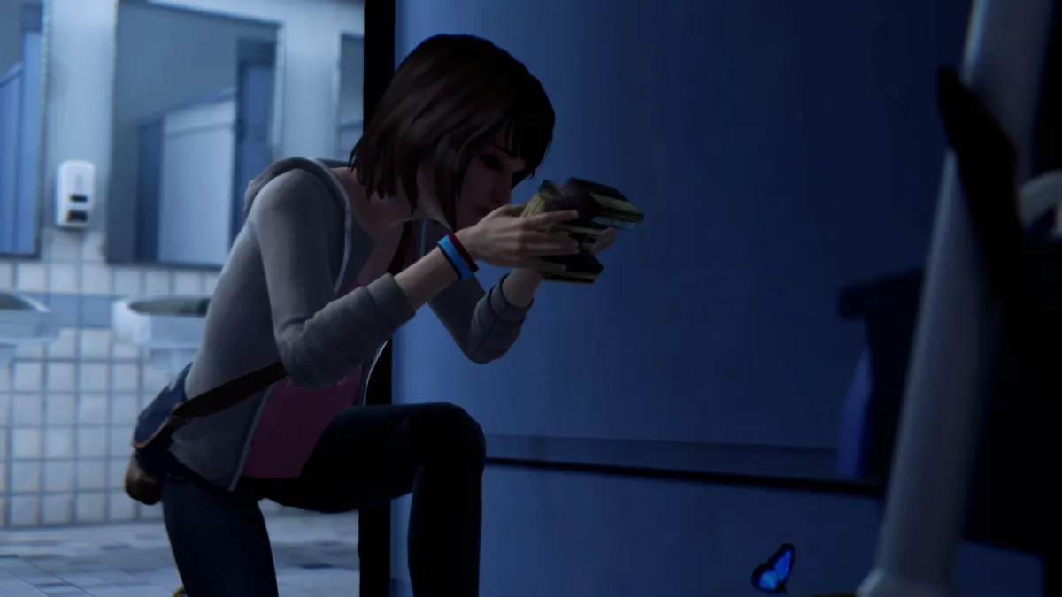
The original Life is Strange is a bit of a modern classic, beloved by many who were enamored by its fun time-rewinding concept and grounded story. Life is Strange: Remastered wasn’t all that necessary, as the original game has held up fairly well. That being said, this new version offers some undeniable improvements that make the game look more modern than before. However, it might not be enough for people who own the original to scramble for the upgrade. Before the Storm also received a remastered version, but since there are more changes in the original (and it’s an older game), I thought it better to focus on the first.
As for what’s different about the visuals in Life is Strange: Remastered, the largest difference is that the facial animations have been mocapped to make things less stilted. Faces animate differently now, but they’re still constrained some by the character models, so this doesn’t make the biggest difference in the world. Going back and forth between the two versions, it isn’t the most obvious thing in the world and which you prefer will likely come down to personal preference. I do prefer the mocapped ones, but I could easily do without them at the same time.
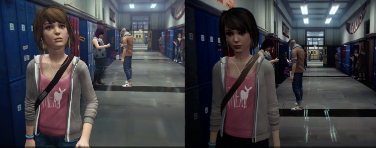
A more immediately noticeable difference is that the textures have been massively overhauled. The original game’s textures had an almost watercolor look to them, which I can’t help but feel was a focused art style decision. In Life is Strange: Remastered, many of these watercolor-looking textures have been replaced by more realistic ones. There are places where you’ll still see tons of these textures, but the game looks more realistic across the board, really. But that absolutely steps on the toes of the original game’s art so, again, this is going to come down to preference. Suffice to say, if you prefer the original’s dreamier, simpler aesthetic, this remaster isn’t going to seem like that much of an improvement — as far as the look of the world is concerned.
Baby, what have you done with your hair?
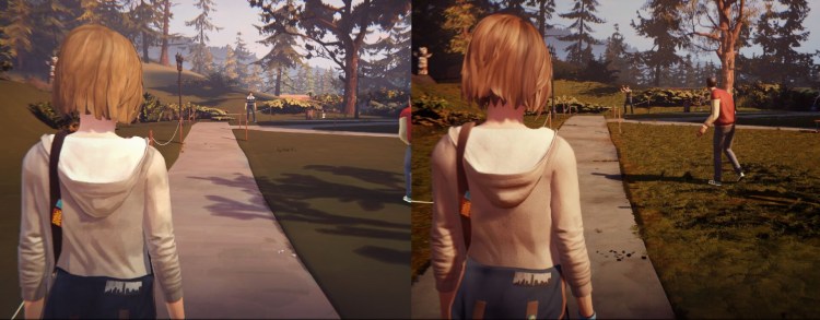
One way the original game is most dated when looking at it with modern eyes is the hair. Just like how general textures have that watercolor look, the hair does too. It’s kind of awkward to look at and makes the characters appear more doll-like. Life is Strange: Remastered gives most character models new, more realistic hair. This is one way that the game absolutely improves upon the original. This extends to characters with facial hair. In the original, Mr. Jefferson’s beard was just a flat color. Here, he actually has hair rendered on his face. On another note, FXAA is the only anti-aliasing available in the remaster, whereas the original had FXAA and MSAA. Weird.
Life is Strange: Remastered also looks a lot better when you’re outdoors. The original game didn’t have grass as much as it had grass textures. But looking at grassy areas now clearly shows that these formerly-barren sections are now decked out with actual blades of grass. Again, this is notably different art direction, but I can’t see it as anything other than an improvement. Additionally, the lighting is more realistic, as are the reflections. This is simply a more realistic-looking game. Here are some direct comparisons between the two to give you a better idea.


Published: Feb 1, 2022 07:18 pm